BRAND KIT TOTAL KIT
Everything you need to represent the Cheddar Labs brand accurately across all platforms.
01. Logo
02. Color Palette
Brand Black
#000000
Primary text and contrast color
Snow
#f7f7f7
Main background and neutral surfaces
Cheddar Orange
#eb980a
Primary accent and interactive color
Seaweed
#00b295
Secondary accent and success states
Platinum
#efefef
Secondary background and borders
03. Typography
Display & Branding
Colo Pro
A bold, geometric typeface used for the logo and primary headings to convey strength and modernism.
Aa Bb Cc Dd Ee Ff Gg Hh Ii Jj Kk Ll Mm Nn Oo Pp Qq Rr Ss Tt Uu Vv Ww Xx Yy Zz
0123456789
Body & UI
Prompt
A versatile sans-serif used for all body text, UI elements, and subheadings, ensuring high readability across all devices.
Aa Bb Cc Dd Ee Ff Gg Hh Ii Jj Kk Ll Mm Nn Oo Pp Qq Rr Ss Tt Uu Vv Ww Xx Yy Zz
0123456789
04. Imagery Style
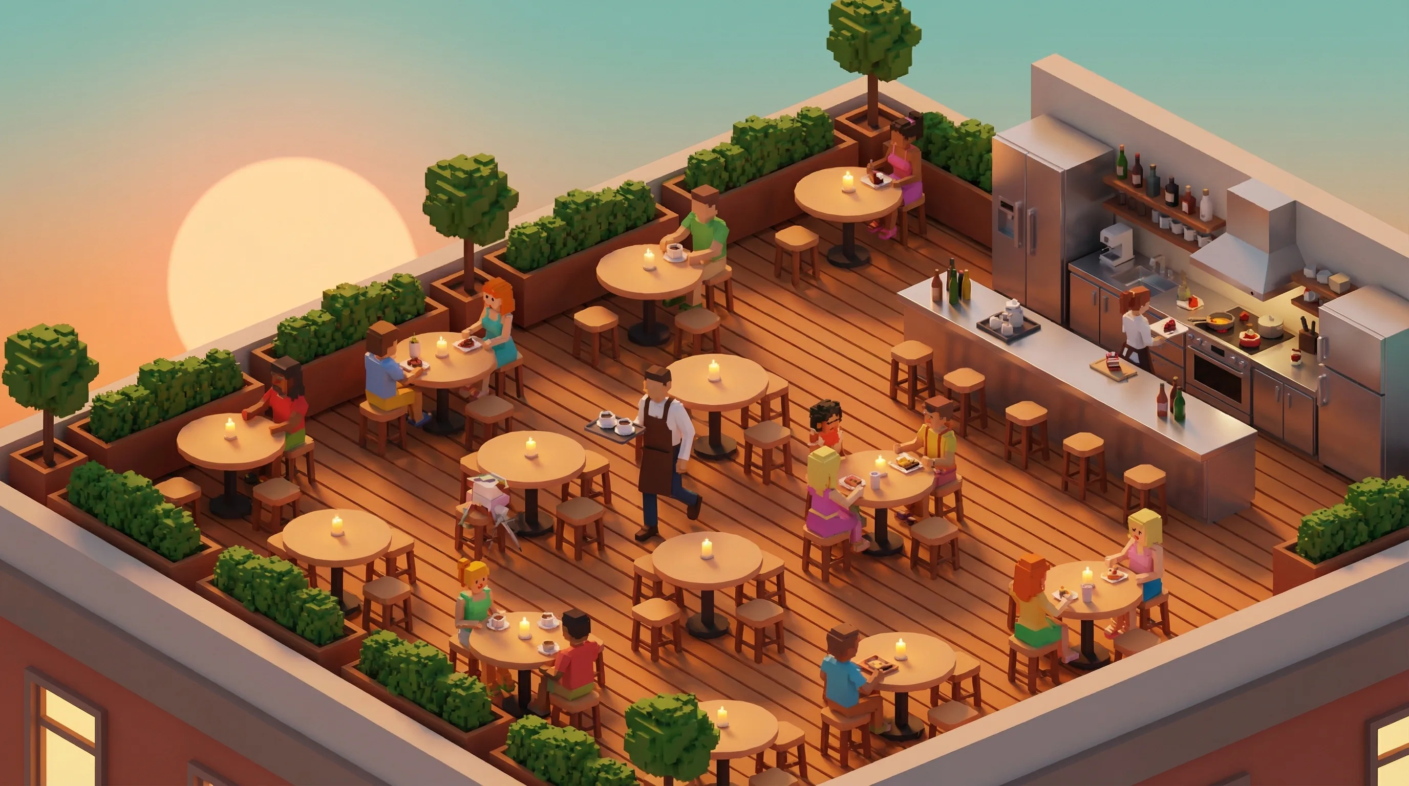
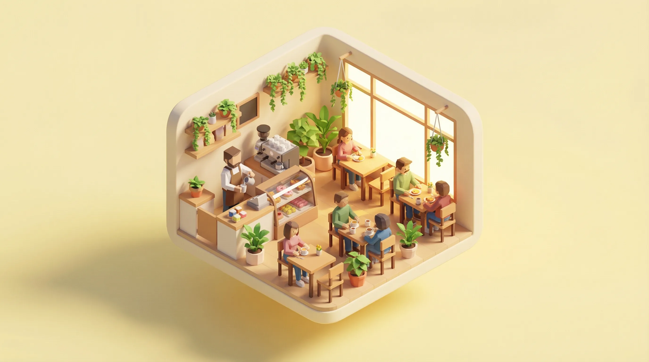


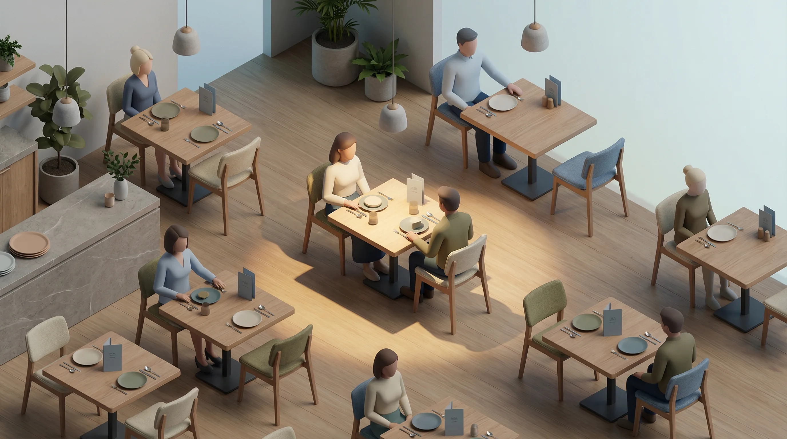
Our visual identity is anchored by bespoke isometric 3D illustrations that capture the energy and flow of modern dining spaces. These stylized, high-fidelity renders use warm, inviting tones and clean geometric precision to represent the "Dining OS" as an organized yet human-centric ecosystem. Each scene emphasizes social interaction and architectural harmony, reflecting our commitment to bringing order and intelligence to the hospitality world.
05. Interface Elements
Interactive Buttons
Buttons use a fully rounded "pill" shape, high-contrast backgrounds, and bold typography to drive action.
Surface & Elevation
Surfaces use generous corner radii (24px-64px), soft XL shadows, and glassmorphism (backdrop-blur) to create depth.
Design DNA Analysis
- Floating Depth
Usage of parallax floating elements (icons, food items) to create a sense of verticality and "intelligence layer" metaphor.
- Systematic Micro-badges
Feature highlights use pill-shaped badges with distinct icons and semantic colors (seaweed for success, orange for warning).
- Grid Alignment
A strict 7xl centered grid with wide gutters (px-10) ensures content breathes and feels professional.
06. Layout & Grid
The Standard Container
We use a strict 12-column grid system within a 1280px (7xl) container. Content is padded with 40px (px-10) on desktop to create a clean "island" feel for all marketing sections.
Spacing Scale
READY TO BUILD?
Download the complete asset package including logos, icons, and brand guidelines in high-resolution formats.